The first mobile insurance for your Camera Bicycle Notebook Tablet
design process for creating KIPO.
In 2019 HDI Seguros wanted to create the first digital insurance experience for personal items in México. I was the lucky Lead Designer in charge.
To comply with my non-disclosure agreement, I have omitted and obfuscated confidential information in this case study. All information in this case study is my own and does not necessarily reflect the views of HDI Seguros.
About design process...
I strongly believe that in order to create a good user experience, the following stages must be included in the product design.
Understand
The problem, the business and the users needs.
Research
Competition, trends and user behaviour.
Prototype
Sketch ideas and wireframe them.
Testing
Usability testing, identify improvements.
Branding
Define UX/UI guidelines.
I would also like to include the Launching stage, but it’s implied that the product will have a launching at some moment. I also created a marketing launching proposal for this product, based on the research made.
Context (Homelock)
By the time I took this product idea, some research was already made, we knew people was looking for this. It even had a name: Homelock, but we will talk about it later. My job was to turn the idea into a digital product, starting with the prototype.
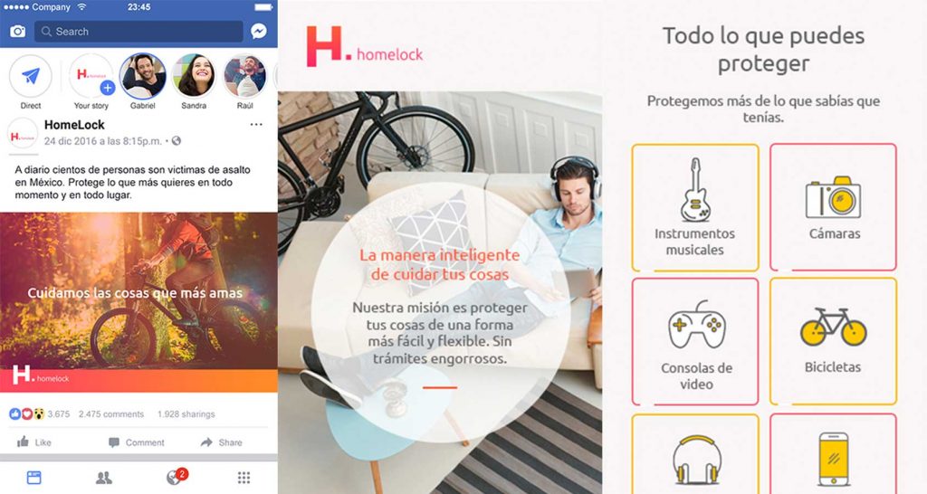
The research consisted on paying Google Search and Facebook ads, then measuring the public interest nationwide. People who clicked on the ad were directed to a landing page. In a month we collected 156k impressions and 3k clicks.
The Challenge
Since this was a new product, that changed the way we did things within the company, the biggest challenge was to coordinate every deparment involved in the whole experience. From subscription to claims, everything was digitalized.
The Problem

Most people insure their home or car, not their stuff.

People interested in securing items, want cheap on-demand services. (Like Netflix)

To get insurance, you have to go through long paperwork procedures.
My Role
I was in charge of creating the digital experience and connecting it with the real life experience, since this is a service not just an app. In different parts of the process there were people involved. We did the research, prototypes, validation, UX design, branding and marketing campaing.
Research
The product’s goal was not only to innovate, it also sought to attract new audiences. Insurers generally look for an audience with responsibilities like a car, home and family. But what about millennials who rent, ride bicycle and have no children? So we looked for profiles that were interested and the following were the most attractive for the business:

Photo & Videographers
Pro and Semipro people who shoots while traveling or working.
A good camera goes from 10k to 80k mexican pesos.

Musicians
People who plays an instrument but not necessarily makes a living out of this.
Music instruments are between 8k and 50k mexican peso, depending on the instrument.
Bike lovers
Young people who uses this as transportation everyday or weekend recreation.
A nice bike goes from 10k to 120k mexican pesos.

Gamers
People who spends at least 1 hour a day playing videogames.
Gaming consoles starts at 7k and gaming pc’s starts at 20k.
We talk about people use this items for fun or by choice. They like to spend money on this items and they take care of them. Some of them might use it for work too like musicians, photographers or videographers.
Insights
According to the research made by the agency we hired, most of the target audience:
- Were between 23 and 37 years old.
- Aren’t willling to pay more than 300 for a monthly fee.
- Prefer on-demand services than contracts.
- Use service apps like Netflix, Spotify, Uber Eats, Amazon, etc.
Sketching, Wireframing and Testing
The first prototype consisted in the subscribing “happy path” and robbery reporting.
We tested this concept with a group of people between 23 and 37 years old, all of them had at least one item of the list.
We asked the following questions:
- Would you protect your items with Homelock?
- How do you protect your things today?
- What is the worst thing that could happen to your stuff?
- How much would you be willing to pay monthly to protect your stuff?

This were the average results:

Photo & Videographers
All of them would use the app on a range from 200 – 400 mexican peso. The worst thing would be, to be robbed.

Musicians
Just the ones with expensive instruments would use the service, they are willing to pay up to 600 mxp for short periods of time. The worst thing would be to be robbed.

Bike lovers
This group were the most interested on the service on a range from 400 to 800 mxp. Worst thing that could happen to the bike is to be robbed or damaged.

Gamers
This group were the least interested, they were willing to pay up to 200 mxp. Worst thing that could happen to the game console is to get damaged.
Insights
- None of the people interviewed had a way to protect their stuff, they were interested in the service.
- People loved the option to turn off the service whenever they wanted, how easy was the subscription process and the small fees of course.
- Some people mentioned that the first impression they had of the product was some service for their home.
Branding
So we decided to change the name, get rid of the “home” part and create something more catchy and “applike”. Since this was going to be the first insurance digital experience in Mexico, we wanted to show it. We wanted to get noticed by the millennial audience as an on-demand option for stuff insurance.
Launching
In order to maintain a consistent visual style throughout the experience, I needed something simple and easy to memorize. That lead us to use clean and simple images,
Work in progress....
We are still working on this case, we will complete this asap. Sorry for the inconvenience.