the next all-in-one CRM for Latin America
how the user experience was made
I joined escala in 2020 and the challenge was clear.
I was lucky to work on this huge product.
*To comply with my non-disclosure agreement, I have omitted and obfuscated confidential information in this case study. All information in this case study is my own and does not necessarily reflect the views of Escala.
Context (Design was expensive)
In 2014, HDI Seguros México created an innovation department that would focus on the user experience for the next 6 years. My job was to design and manage the products for customers that will be indispensable for any competitive insurer.
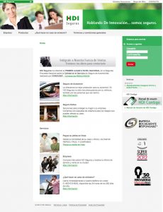
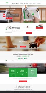
Website’s evolution, click on the image to enlarge it.
The Challenge
- Create an experience that allows different users to find the information they are looking for, in a simple and understandable way.
- Answer the questions Who are you? What do you offer? What makes you different?
- Develop a consistent digital experience for every user.
The Problem
We didn’t have any defined users and their needs.

We needed a strong digital marketing strategy.

Our customer contact points weren’t connected and we were without a clear company message.
My Role
As UX Head, I led a team of 2 designers through all stages of the design lifecycle. The design process I followed and championed includes the research, prototypes, design and website development.
But first, where are we standing?
Before doing any research, we created a map with all the digital contact points. I wanted to understand how people interacted with the company. From the moment they see the first ad, until they turn into customers.
Following an inbound marketing strategy, the user experience path was something like this:
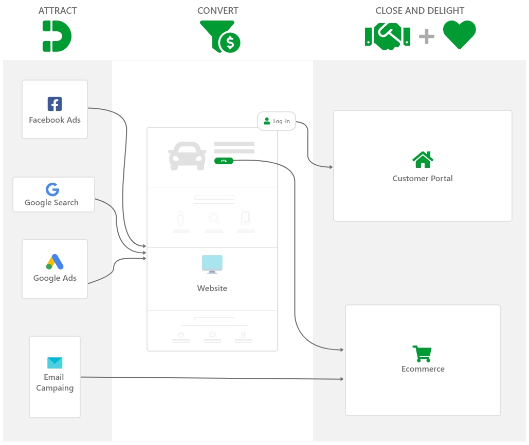
As you can see, I divided the products involved into:
Ads for quotes and email marketing

Social Media

Website

Customer’s Portal
As each product is managed by different departments, I decided to bring the leaders together to create a joint strategy. The products that remained on my side was the Website, Customer Portal and the design of the ads for quotes.
Defining personas
We used information we already had about website analytics. Since 68% of the users were returning visitors looking for specific pages within the website, we labeled them as sales colaborators. Aproximately 20% of the visitors were new, but they also were looking for specific information like insurance coverage, terms and conditions, etc. We labeled them as current customers. The rest of the visitors were new and apparently the weren’t looking for something specific, this are the users who visited pages like About Us. We labeled them as potential customers.

Santiago Diaz | Sales Colaborator
“I need specific info about the product, pronto!”

Elena Vargas | Current Customer
“I don’t know my insurance coverage :(“

José Duran | Potential Customer
“I need car/home/business insurance, but I have no idea which one to choose :/”
Specific goals
After understanding how the user interacts with the company and discovering the users needs, I defined the next goals:

Ads, social media and website are going to be focused on the potential customers.

In order to make sales colaborators and current customers experience super easy, we will avoid making drastic changes.
The whole experience must be reliable, to keep user interest.
Sketching
I sketched the happy path for every user. Some of the products, like the website, need to work for 3 different users. But users will use the website in different moments and ways.
Then I prioritized info and functions based on the goals.
Wireframes made sense, and we could have tested a prototype in this stage, but one of the goals was to create a reliable experience. So I decided to do the testing with a functional website. That allowed us to have a better idea of the users perception.
Design
In order to maintain a consistent visual style throughout the experience, I needed something simple and easy to memorize. That lead us to use clean and simple images,
